The StoryAfter working with the homeowners for weeks to remodel their existing house, we were surprised to get a call saying they were changing gears, and quickly.
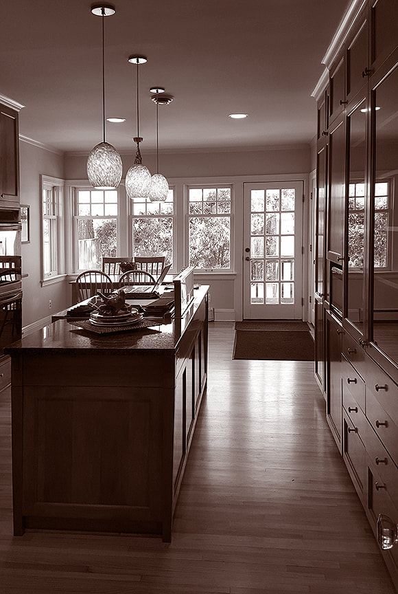
The focus was now on buying and improving a different house. An amazing home had newly hit the market and it wouldn't be there long. After touring the listing, it was clear that the location and price were right. But to make this happen, things had to move fast. Nothing like a prime property with multiple offers hitting the market to turn a project upside down! TIME OF DAY We actually have adjusted the levels on these images considerably and the kitchen is still dark. In addition to the low light, the space was long and narrow, which created a feeling to two spaces within the kitchen.
Once the dust settled, our clients found themselves - instead of adding on to a 40's era house on a busy Minneapolis street - remodeling a secluded, 1920's European-styled cottage along Minnehaha Creek.
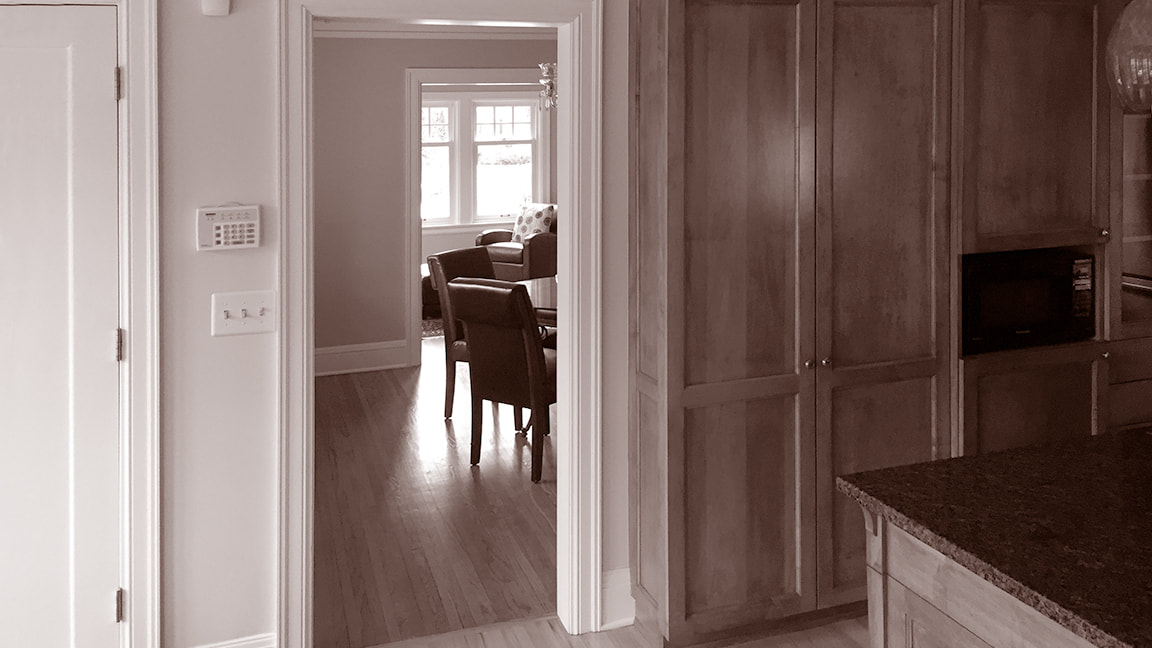
it was a stunning and exciting turn of events. What made the new house so attractive was that so much of the house was right. A secluded urban lot, a great floor plan, multiple large bedrooms with lots of closet space, and plenty of bathrooms for this family of four (and a rotating collection of foster dogs). PEEKABOO, WE SEE YOU Beyond the floor-to-ceiling bank of cherry cabinets and the narrow door opening is the dining room. You had to nearly leave the kitchen to simply see into the dining room.
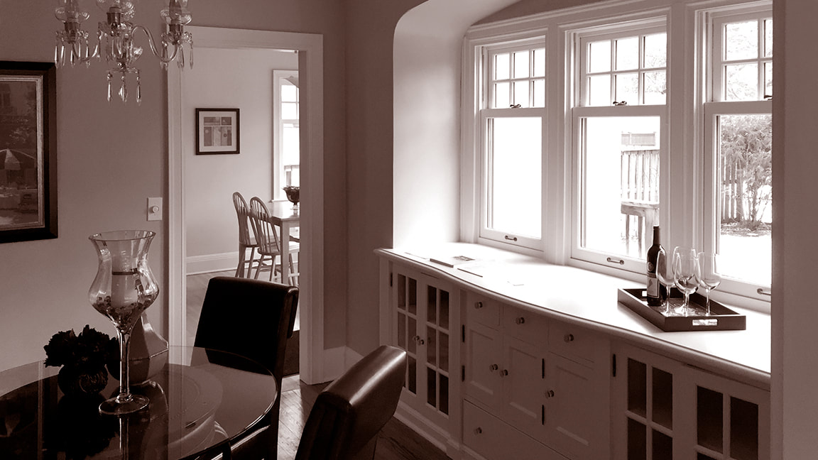
PEEKABOO, WE SEE YOU, PART 2 The lovely dining room had an amazing built in buffet topped by cottage windows, but it was utter separate from the kitchen, offering only a glimpse of the chairs beyond.
But like with many older homes there were two key spaces that needed immediate attention - the kitchen and the master bathroom.
If these two spaces are good, a house is good. If not, well ... |
Homeowner Review
David helped us create the bright, open, modern kitchen and master we dreamed of. He was incredibly flexible with our ever changing ideas and diligent with our endless questions.
David was much more than our architect. He was our sounding board and kept our decisions in check with style, schedule, and budget. David brought some key design elements to the project that we wouldn't have considered, helped us visualize, and also infused our personal design.
< Janelle V. >
Minneapolis
The Project
DESCRIPTION Kitchen and master bathroom remodel
Starting Line
The existing kitchen was nice - back in 1996. Dark, custom-built cherry cabinets, black granite countertops, and aging commercial appliances were vestiges of decade's old style.
But it's not the first outdated kitchen we've ever encountered.
With a bit of work, those features could be easily remedied. What was a little more challenging, however, was the oddly proportioned space. It was long and narrow, which made sections of the kitchen feel cramped, while at the same time making other areas feel too open, unused.
It was an odd situation. Poorly laid out kitchens typically feel too cramped or too spacious, but rarely both.
RAY OF LIGHT The strongest feature of the original kitchen were the windows to the backyard. Although far away from the main kitchen, they provided much needed light and view.
Sometimes opening up a kitchen in an older home is difficult. Layout options can be limited by a nearby stairway, a tight side yard setback, or a doorway that can't be easily relocated. But what made this project compelling was that it could be easily modified and connected with the adjacent dining and living rooms and the backyard.
With some careful and key modifications, this kitchen would be amazing.
With some careful and key modifications, this kitchen would be amazing.
The Modifications
What a Difference an Arch Can Make
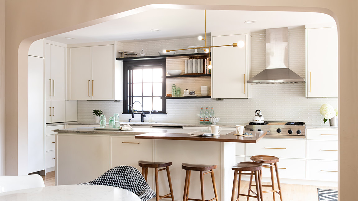
A new 10'-wide archway was introduced between the kitchen and dining room that radically opened the kitchen and linked it to the rest of the house. The new arch profile was a replica of the pointed archways common on the rest of the main level.
This singular modification integrated the kitchen with the dining room, allowed light to flood in, and eased the pressure at the kitchen's most cramped circulation point.
ARCH SUPPORT A new archway not only opens up the kitchen, but connects it stylistically to similar arched openings nearby.
When we remodel older kitchens we routinely adjust the size and location of existing openings, most always with dramatic results in layout, circulation, light and visual connection. This new archway was no exception.
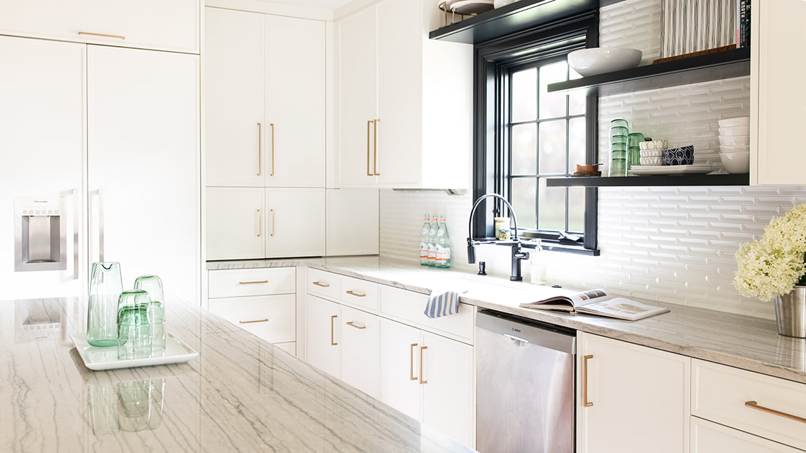
To punch up the drama in the kitchen, the doors, windows, and trim were painted black, offering a dramatic counterpoint to the light material palette in the kitchen.
Cabinet-Level Decision
Traditional kitchens in older homes often feature Shaker-style door and drawer fronts. Contemporary kitchens commonly have full-overlay flat-panels.
Neither felt quite right for this house or this kitchen.
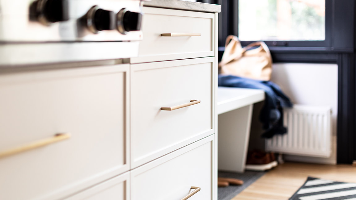
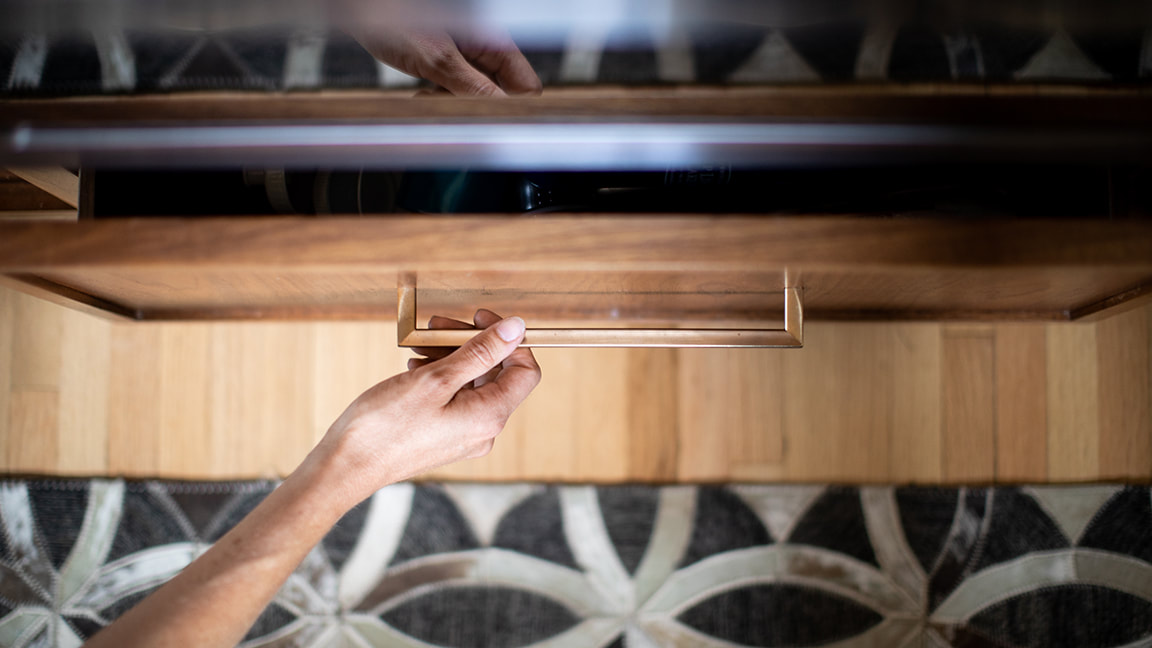
A HANDLE TO HOLD Contemporary brass hardware served as a sleek counterpoint to the oily black finish on the plumbing fixtures - we are big fans of mixed metals.
Instead, the painted white and walnut cabinets feature door and drawer fronts with slimmed-down rails and stiles that hint at a the Shaker style as they delicately frame each door and drawer. It's the type of design-tweak we love to make, one that blends the familiar with the contemporary.
Test Your Metal
The safe, or at least, familiar notion is to keep metal finishes consistent within a single room.
> See another kitchen project with mixed metal finishes
Mixed-metals finishes take a bit more courage of commitment. We are big fans of this approach and so was the homeowner. Brushed brass hardware on the cabinets is paired with a matte black finish on the plumbing fixtures.
HARD ROCK Granite is often considered the hardest stone countertop, but there is another option, less well know, which is even harder, quartzite. On the island you see White Macaubus, a quartzite from Brazil, known for it's long, linear grain and subtle gray tones.
Material Difference
This tired and dark kitchen got the architectural equivalent of a buff and shine. Admittedly, you can't take this kitchen out on the track, but man did it clean up nice!
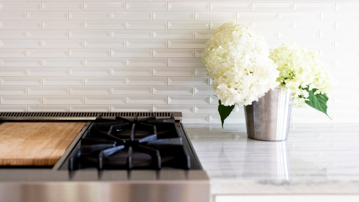
A beveled, white-tile backsplash tile brings dimension, depth, and a clean, fresh aesthetic to the walls. Sleek Brazilian White Macaubas quartzite countertops are paired with a walnut slab countertop extension on the end of the island. It's almost as if the veining in the cool stone continues in the graining of the warm wood.
Ready for a shocker?
The island cabinets have two finishes as well - the back and sides are white enamel, but as you spin around the island, you discover that the doors and drawers on the front are walnut.
These kinds of details get us really excited.
Yes, we are design nerds.
COOL & WARM The challenge when designing a mostly white kitchen is that, if you are not careful, it can get cool and featureless. White doesn't necessary equal bland, but it can equal too cool (and not in a good cool kind of way). To counter this, we supplemented the material palette with touches of warm American mahogany, as a slab countertop extension and on drawer fronts at the island.
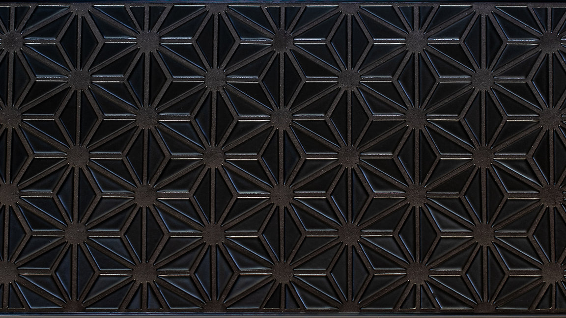
DIMENSION & PATTERN Some of the most compelling and satisfying design decisions center around tile selections. It is a process most people feel at least somewhat familiar with, but can still be surprised by the options and results. Here, we kept the color palette tight and instead focused on dimension and pattern. The kitchen backsplash features a dimensional wall tile that uses shadows to animate the surface. At the bar, we used a black-on-black color scheme with matching tile and grout color. It has an unexpected affect to actually highlight the tile pattern, as our eyes begin to "hunt" for the pattern, which begins to slowly emerge.
Master of None
A small master bathroom - about the size of a modest closet - was our starting point.
Dirty tile, old fixtures, and a moldy shower had seen their better days. So we gutted the bathroom, changed its location, and borrowed some space from the neighboring closet and laid out a new a new sophisticated bathroom that is both beautiful and efficient.
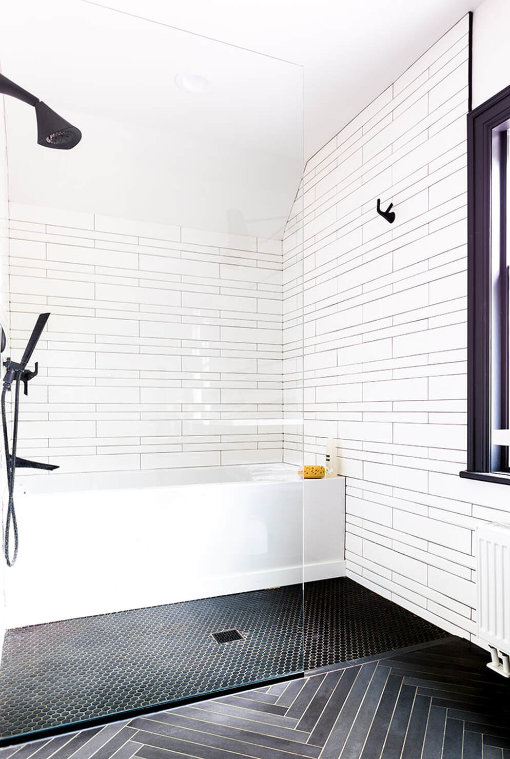
Still a compact space, the new master bathroom features a unique, curbless tub/shower room, where both the shower and tub are grouped behind a simple glass panel. With no separation between tub and shower, both items are not only designed to get wet but to allow the user to go from shower to tub and back again.
TWO TONES Even limiting the tile and grout palette to just two colors, black and white, we are able to generate a complex tile layout with lots of interest and variety.
Going Curbless
The builder and plumbing inspector weren't thrilled with the layout, but the homeowners certainly were. Installing a curbless shower on the upper level is challenging.
Typically, you have less floor structure to work with, which makes dropping the shower floor a few inches a bit dicey.
Add to the mix issues of proper drainage and protecting against leaks, especially at the base of the tub. Most tubs don't have to prevent leaks at the floor, but this one does.
This compact shower/tub configuration along with a simple heavy glass wall panel, not only reduces its footprint and but helps the bathroom feel larger than it is.
Tile Time
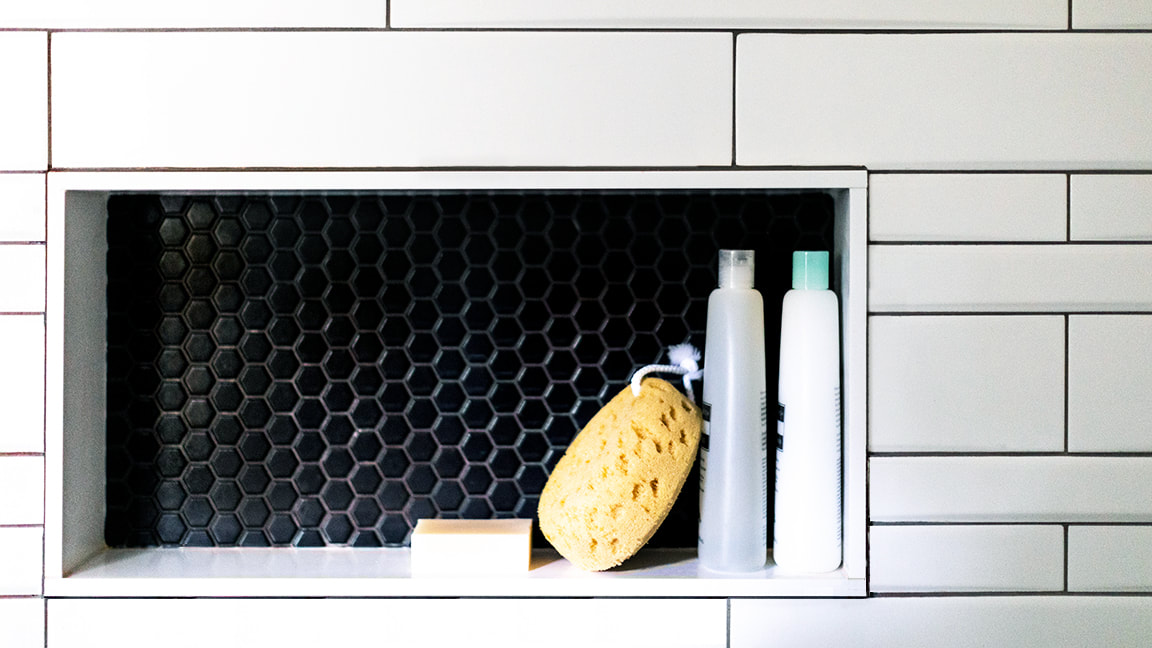
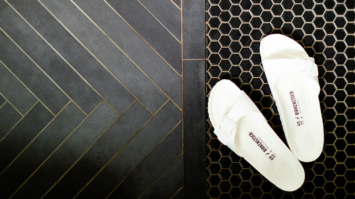
This bathroom is also a master class in tile. A simple black and white tile palette is used in a variety of ways in combination with a range of tile profiles.
Black hex with black grout, long grey floor tile laid in a herringbone pattern with grey grout, and an elongated and radiused white wall tiles are ringed by black grout.
The odd thing with tile - the more you restrict your palette, the more creative you can get. It may be that we have to work harder, find new and unusual ways to generate interest, but in our experience, black and white tiles push our design sensibilities.
Vanity Thy Name Is ...
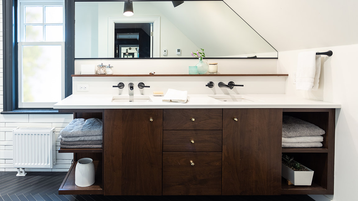
A vanity is the focus of most master bathrooms, but this bathroom's compact layout made fitting in a double vanity a challenge. Nestled between a half wall and a window, we found just enough room to make it work.
Adding to the complexity was an angled ceiling. So, we shifted the sinks over a bit and added some open storage at the wall. The angle also creates a unique vanity mirror profile,
Rimmed in black metal the unique mirror shope turns a constraint into a feature.
Below the mirror, a shallow, walnut ledge sits atop a partial height wall behind the vanity, offering additional storage and display flexibility while, at the same time, keeping the drain and supply lines out of the exterior wall - no small consideration during a Minneapolis winter.
OPEN SESAME An open-ended vanity "dissolves" at the window, a detail designed to keep the small bathroom open and from feeling, well, too tight.
Hard-earned solutions, a smart layout, and charming spaces bring pragmatism together with beauty.
At the end of this project, both sides of our brain were satisfied
At the end of this project, both sides of our brain were satisfied


